Brighter not Bigger
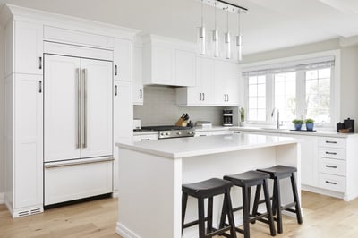
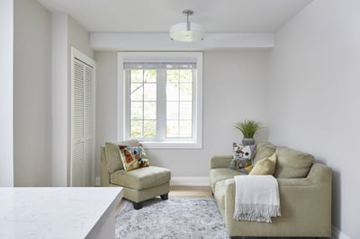
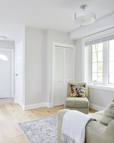
The change was necessary for the next chapter to unfold in this sweet home. By opening up the space, family and friends will have more room to move about freely. We discovered sweet spots for our clients to pursue and develop while walking through the home.
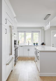
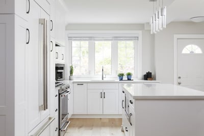
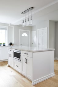
The front window provides the best view of the streetscape. There is plenty of natural light, space for the new sink, and counter space for more small appliances. As soon as we saw the interior walls, we knew they had to go.
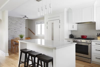
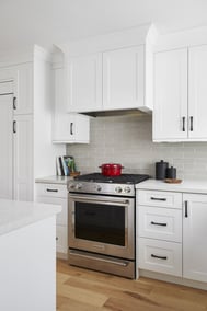
A major part of improving this kitchen is adding more storage. As well as creating a fresh white palette, it allows color accents to be chosen freely. When hosting large gatherings, the island serves as a preparation area with a large surface.
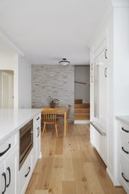
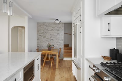
The faux stone feature wall in the dining area provides texture and a new layer to the space. This creates a “mood” or an overall feeling for the new space.
